6 considerations for Accessible chatbots
I’m seeing more public sector product teams starting to build AI chatbots into their services. For many of them, this kind of interface is still uncharted territory. Some less than ideal practices from the big AI firms are being used for design references - and they’re not always accessible.
So perhaps it’s a good time to talk about a few areas to focus on when trying to make an AI chatbot accessible.
AI chatbot interfaces
In this post, I’m talking about web interfaces, where you can type a prompt (an instruction to the AI) and you get a response back. I’m sure lots of people are familiar with AI chatbots by now (it’s hard to do a Google search in 2026 without ending up interacting with Google’s AI mode). But it’s good to be clear about what I mean when I’m talking about AI chatbots here.
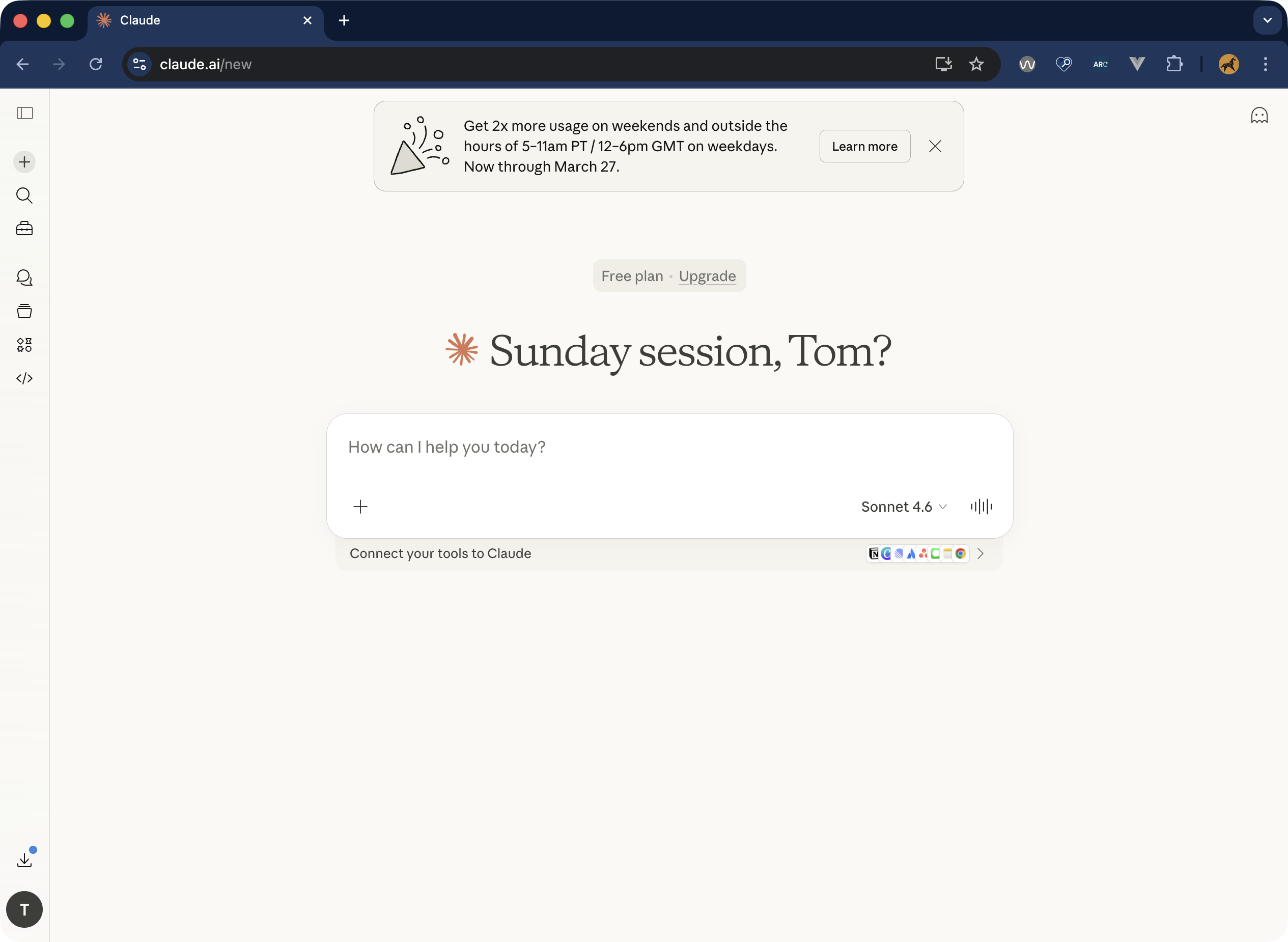
The prompt is usually text, but it could include images, or videos too. The response is typically a mix of text, media, and suggested follow up questions. Here’s an example from Anthropic’s Claude interface:
In many ways, it’s a simple interface, and the accessibility considerations aren’t that complex. So what do we need to think about?
- Responses need to be announced by screen readers
- Inputs need to be labelled
- Scrollable areas need to be keyboard accessible
- Empty states and whitespace don’t harm navigation
- Feedback mechanisms are clear
- Animations are respectful
1. Responses need to be announced by screen readers
Let’s start with announcements. Most of the teams I’ve worked with understand that dynamic content changes need to be announced by screen reader software.
But there are a few possible approaches to AI responses that you could take here. Which way you get the responses to be announced in part depends on the response.
Read the whole message
One approach might be to have screen readers announce the whole body of the response when it has loaded. This could be OK when the chatbot responses are very short and just text. To get content to be automatically announced by screen readers, we could use live regions, with ARIA. This will mean the user doesn’t have to move keyboard focus, or the screen reader cursor to that bit of content.
The live region announcement won’t include any semantic information. So if there’s buttons, headings, links in the changed content, the fact that they’re buttons, headings or links won’t be conveyed by screen readers. It’ll be a bit like the contents were plain text. The semantic information will be there for screen reader users if they go to the response and read it, but it won’t be part of automatic announcement.
Here, we could add in each of the attributes we need to get screen readers to announce the new content. So, adding aria-live="polite" to have screen readers announce the new content when there’s a suitable gap. And aria-atomic="false" to make sure the screen reader only reads the content that has changed.
The log role is another option for this. The log role implicitly uses aria-live="polite" and aria-atomic="false". Semantically, it should be just what we need.
What’s the log role? According to the WAI-ARIA 1.2 spec, it’s “A type of live region where new information is added in meaningful order and old information may disappear […] Examples include chat logs.” In our chat interface, we’re adding new information in a meaningful order (prompt, then response, then follow up prompt, et cetera.)
Here’s how that would be implemented in code:
<div role="log" aria-labelledby="chat-heading">
    <h2 id="chat-heading">AI chat history</h2>
    <ul>
        <li>In a sentence, what easy recipes use basil as an ingredient?</li>
        <li>Easy basil-based recipes include fresh Caprese salad with sliced
        tomatoes and mozzarella, homemade basil pesto blended with pine nuts
        and parmesan, and simple tomato basil soup</li>
    </ul>
</div>
If you look through the WCAG docs, you can also find a working example of the log role, using a chat interaction to demonstrate, no less.
It sounds like it fits the bill, but you need to test this. Support for the log role (and other live region roles) across screen readers has been historically mixed. I tested with JAWS and macOS VoiceOver and it behaved as expected. However, iOS VoiceOver didn’t always announce new content correctly.
Speaking to other accessibility specialists, there’s a theme around screen readers on touch devices not supporting the log role well. Check out A11y Support, Deque’s Live Region Playground, and Sara Soueidan’s in-depth two-part article on live regions if you want to dive into more detail here.
So, perhaps a different approach…
Announce that there is a new message, but don’t announce the message
Not announcing the actual message content might not seem very helpful on the face of it. However, this might be a better approach for an AI chatbot responses. See, some chatbots don’t output a response in a one-shot. They output a line of text at a time (or part of an image). Starting to announce the whole response content when the response isn’t complete yet might not be a good experience.
Further, responses might be very long, multi-part, or have different kinds of content. That means it might be a bit overbearing to announce the entirety of the response, and some of the content might not be as clear without the semantic context.
So it might be better for the screen reader to announce the status of response generation - for example "response generating", or "response ready" - rather than the response itself. That would help us out when our responses are incomplete, long or multi-part. You can also provide mechanisms for users to jump straight to that response too, so that they can go and read it for themselves (Deque’s Axe Assistant work like this, with a button to “Go to recent response”).
Implementing this can be achieved by having a container with a role of “status”, whose content gets added, updated or replaced. The container should be present when the page loads - you need to add the content to the container when you want a status message to be announced.
<div role="status" aria-atomic="true">Response generating</div>You need to give careful consideration to what response statuses you want to convey. It also might help non-screen reader users to see these statuses as well, so you might not want to hide this content.
WCAG Success Criteria to pay attention to
2. Inputs need to be labelled
We know that form inputs need to be labelled so that users know what to do. There should be a visible label, and an accessible name (usually just the same as the label). Sighted users can rely on the visible label to know what to input, and screen reader users will hear the accessible name of the input.
Voice recognition software users work with a combination of the two. Most voice recognition users will speak commands based on what they see on screen. Then the software interacts programmatically with the accessible name. So, I can see an input labelled “First Name”, I say “click First Name”, and as long as the accessible name matches, my command should work.
This is fairly basic need, and one that most teams understand the importance of. When it comes to chatbots, an unfortunate trend has taken hold. There’s some design convergence around not visibly labelling the prompt input field. Some chatbots use placeholder text, but that’s not really much better. Chat-GPT, Copilot, Google AI mode and Claude all use placeholders to label the prompt input. They also each have curious ways of providing accessible names.
This might be the convention, but that doesn’t mean it’s good. Voice recognition users are going to have a harder time selecting the input, because one or more of the following is true:
- there’s no visible label
- the label is a placeholder, so as soon as you start entering in text, the label disappears
- there is placeholder text, but that’s completely different to the accessible name
So, don’t be like the others - add a persistent, visible label, and make that the accessible name for the prompt input.
WCAG Success Criteria to pay attention to
3. Scrollable areas need to be keyboard accessible
Chats can get long! So that means we’re going to have to scroll up and down to read back through the chat. Most of the time, this is no problem - you just scroll the page. There are a couple of things to flag here though.
First, you’ll probably have your prompt input area stuck to bottom of the viewport. That’s fine, but bear in mind any sticky content (using position: fixed or position: sticky in CSS) will obscure content beneath it. You’ll need to ensure that you don’t completely obscure focusable elements in the chat with your sticky input.
Check out 2.4.11 Focus Not Obscured in WCAG for more detail here. A good way to test this is to Tab forward through interactive elements and check if your sticky content hides anything. And then, crucially, pressing Shift + Tab to go back through elements checking the same thing. Navigating with a keyboard is more difficult when keyboard focus is not visible, or obscured. So we need to implement sticky content carefully.
Second, you might want more than one scrollable area in your chatbot interface. If you have a sidebar or panel next to the main chat interface, you might not want to scroll the whole page to get to that sidebar content. You can put the sidebar content in a scrollable container. That container needs to be scrollable with a keyboard (using arrow keys), as well as a mouse.
WCAG Success Criteria to pay attention to
4. Empty states and whitespace don’t harm navigation
Let’s think back to the first screenshot in this post, of the Claude interface. One of the notable things about that screen is that it is remarkably empty. Before interacting with a chatbot, there’s not really much going on in the interface. Just a big input box to write your first prompt, usually floating in a sea of empty space around it. Great, minimal design, but possibly not ideal for people who use screen magnifiers.
When zoomed into the screen with 8 or 10 times magnification, finding that prompt input is going to be difficult for some users.
There might be several ways to address this. Adding in controls to skip to the prompt input could be an option. Aligning the prompt input closer to the top left of the viewport could be another.
First though, I’d recommend doing some research with screen magnifier users. As chatbots become more and more common, it might be that users have developed adaptive strategies for navigating them.
5. Feedback mechanisms are clear
Chatbots produce responses based on models. This should come as no surprise, but, they’re not perfect. (a quick Google search for AI hallucinations, and you’ll see what I mean).
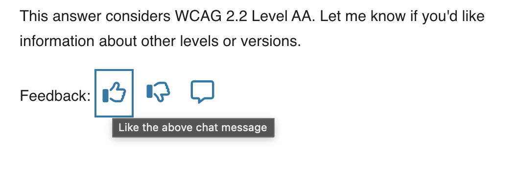
Most AI chatbots show some acknowledgement of their fallibility. This is why they have things like thumbs up/thumbs down buttons under responses for you to provide feedback. In a public sector context, transparency and accuracy are critical. You may already be thinking about designing in feedback and reporting mechanisms for responses.
Where you have several chat responses on a page, you’ll also likely have several feedback buttons. You will need some unique names for each of these buttons, so that it’s clear which button is for which chat response.
If you’re just using icons, without visible labels, then it is essential you have an accessible name for each button. A common approach is to use an aria-label. But what do you call each button, so that it clearly relates to a particular response?
You could use the timestamp of the response (so, “like the response sent at 13:02”). That perhaps just creates another overhead for the user though. Now they have to figure out what response was sent at which time.
A far simpler naming method is to refer to the “above” or “previous” response. For example, “like the above response” or “dislike the above response”. It’s generally acceptable to use “above” and “below” to mean “before” and “after”.
(There’s a specific note about this in the WCAG understanding docs, under 1.3.3 Sensory Characteristics).
I have to admit, I spend so much time in the mindset that elements need to be linked programmatically. Sometimes I forget about this more straightforward approach.
6. Animations are respectful
Dynamic content - the stuff that gets injected into the page, without a page reload - is pretty much a necessity with AI chatbots. More often than not, that dynamic content is animated as it loads in. I’m sure this is a smoke and mirrors conceit, rather than a technological constraint…
You might also want to use animations to indicate a “loading” or “response generating” status. If we’re animating stuff on the page, that can be engaging for some people, but actively harmful for others. That does not mean we cannot ever use animations. We need to be careful when we do use them though, and we need to respect the preferences of users who don’t want to see these animations at all.
Check out this post from Adobe’s Stefan Chitu: Animation that fails safely: Defensive design for motion-sensitive users. Stefan gave a great talk at this year’s Axe-Con, based on that post, that has lots of useful tips on designing accessible animations.
WCAG Success Criteria to pay attention to
2.3.3 Animation from Interactions (Level AAA)
Conclusion
So there are my thoughts - I’ll come back and update this post as I learn more about how chatbots are used in a public sector context and get more practical examples. In the meantime, let’s make sure we go back to first principles when designing interfaces, even if the technology is treading into new territory.
Updated 31/03/26 - I updated the section around the log role to add some additional warnings about its use (and to more clearly steer towards the “Announce that there is a new message, but don’t announce the message” route). Thanks to Adam for the excellent background knowledge on the log role here.